

Ten seconds. That’s approximately how long a first-time visitor to your website spends deciding whether to stay or leave. Not ten minutes. Not ten pages. Ten seconds of their attention to determine whether your website is going to give them what they came for — or whether the back button and the next search result is a better use of their time.
For most Mornington Peninsula business websites, those ten seconds are currently being lost. The visitor arrives, sees something that doesn’t immediately answer their question, and leaves — often without the business owner ever knowing they were there. Understanding what converts in those first ten seconds, and what doesn’t, is the most commercially impactful question in web design.
The Ten-Second Test: What Your Homepage Must Communicate Instantly
What you do. A visitor should know within three seconds of landing on your homepage exactly what your business offers. Not vaguely — “we provide quality solutions for your needs” — but specifically. “Web designer for Mornington Peninsula small businesses.” “Emergency plumber serving Frankston to Sorrento.” “Osteopath — Mornington.” If your homepage headline requires more than a sentence to establish what you do, it’s doing too much work.
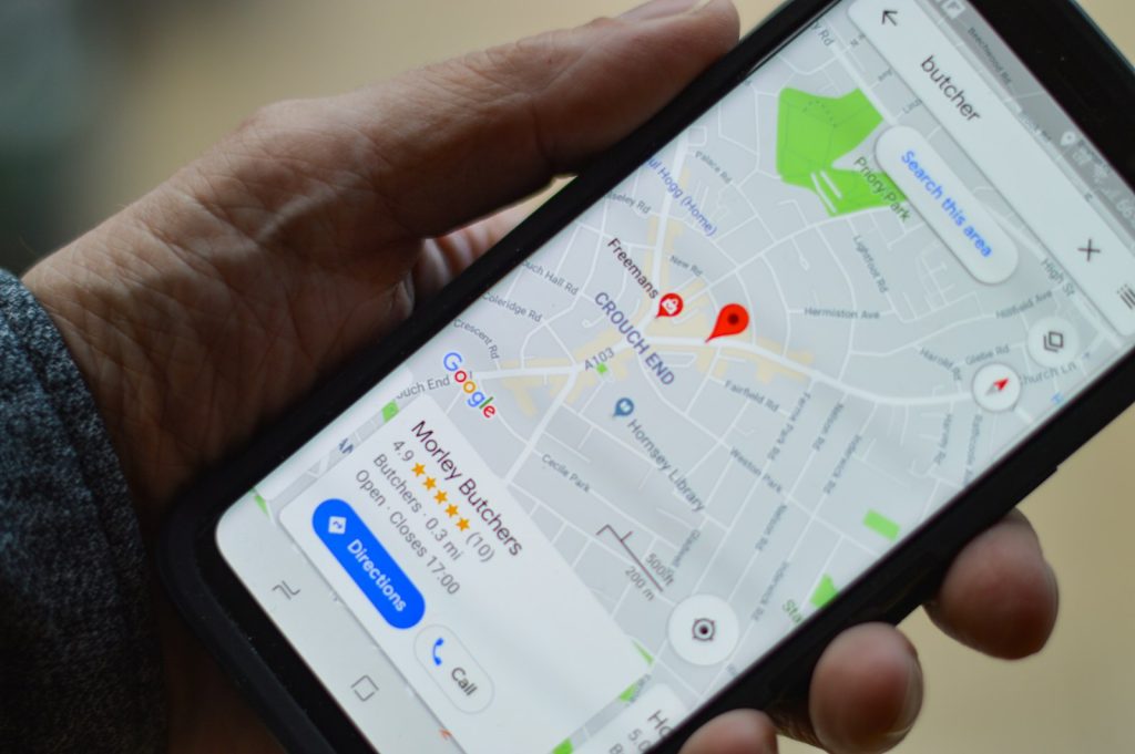
Where you do it. For a local business, geographic context is essential information. A visitor searching for “accountant Mornington” needs to confirm immediately that they’ve arrived at an accountant that serves Mornington — not an accountant based in Melbourne who has optimised for Peninsula terms. Your suburb or service area should appear in the visible portion of the homepage without scrolling.
Why you specifically. There are multiple businesses offering what you offer within the visitor’s search radius. Why you? One or two specific, credible differentiators — not generic claims — should be visible without scrolling. “500+ websites built across the Peninsula.” “100+ five-star Google reviews.” “On page one for our clients within 80 days.” “Family-run, in-house team — no outsourcing.” These are specific and verifiable. “Quality service and great results” is not.
What to do next. Every homepage needs a single, obvious primary call to action — the thing you most want a first-time visitor to do. For most local service businesses, this is either “call now” or “get a free quote.” The action should be immediately visible, visually prominent, and frictionless. A phone number that’s tap-to-call on mobile. A quote button that leads directly to a short form. One clear next step, not five equally prominent options that create decision paralysis.
What Kills Conversion in the First Ten Seconds
Slow loading. A page that takes more than two seconds to display its main content is one where a significant proportion of visitors have already left before the ten-second window even starts. Speed is not a nice-to-have — it’s the prerequisite for everything else on this list.
Generic stock photography as the hero image. A handshake over a desk. A smiling call-centre worker with a headset. A family in front of a generic house. These images communicate nothing specific about your business and actively undermine the credibility of what follows. Original photography of your actual work, team, or premises converts at meaningfully higher rates than stock images that any competitor could use.
Too many competing messages. A homepage that tries to simultaneously communicate every service, every credential, every client type, and every promotional offer creates visual noise that the visitor processes as confusion. Confusion leads to leaving. The homepage has one job: create enough confidence and clarity to make the visitor take the next step. Everything that doesn’t serve that single goal is friction.
Our pool installer client went from 5% to 15% conversion — a 200% improvement — after we rebuilt their website with a focused conversion architecture. Same traffic. Same services. Different homepage. The Click Websites approach to homepage design prioritises commercial outcomes over aesthetic ambition. Request a free website health check to find out how your current homepage performs in the ten-second test, or get in touch to discuss what a conversion-focused rebuild would involve.
Frequently Asked Questions
Should my homepage be long or short?
Length should serve the visitor’s decision-making journey, not a design preference. For a simple local service business (a sole-trader plumber, a personal trainer), a focused one-page homepage with the essential elements — headline, differentiators, services overview, social proof, contact — is often more effective than a long scrolling page that delays the call to action. For businesses with complex service offerings, multiple client types, or a longer consideration cycle, more depth is appropriate. The rule is: every section should move the visitor closer to contact or should be removed.
How do I know if my homepage is currently converting well?
GA4 conversion tracking shows how many homepage visitors are completing your desired action (form submission, phone link click). The engagement rate report shows whether visitors are engaging with the page or bouncing immediately. Heatmap tools (Hotjar, Microsoft Clarity — both have free tiers) show where on the homepage visitors are scrolling to, where they’re clicking, and where they’re stopping — revealing which elements are receiving attention and which are being ignored.
What should the hero section of a local business homepage contain?
The hero section — the content visible on screen before any scrolling — should contain: a headline that clearly states what you do and where, a sub-headline that adds one specific differentiator or value proposition, a primary call to action (typically a button linking to your contact or quote page, and a tap-to-call phone number), and a hero image that’s relevant to your business and location. Everything the visitor needs to decide whether to proceed should be in this first screen.
How important is mobile optimisation for homepage conversion?
Critical — the majority of local business website visits happen on mobile, and the mobile homepage experience is typically worse than the desktop one. Common mobile homepage problems: phone number not tap-to-call (requiring the visitor to manually copy and dial), call to action buttons too small for comfortable tapping, hero image loading too slowly on mobile data, and text too small to read comfortably without zooming. Test your homepage on an actual mobile device — not just in a desktop browser’s mobile simulator — to experience it as your visitors do.
Should I show pricing on my homepage?
For businesses where transparent pricing is a genuine differentiator (cleaning services, web design packages, coaching programs), showing indicative pricing or “starting from” amounts on the homepage communicates confidence and pre-qualifies visitors by budget. For businesses where pricing varies significantly by project scope, a “get a free quote” pathway is appropriate. Never use “contact us for pricing” as the default response to every pricing question — it’s a friction point that sends comparison shoppers to competitors who provide at least some pricing context.
Can a bad homepage undermine good SEO?
Yes — significantly. A website that ranks well in search but has a homepage that fails the ten-second test generates traffic that doesn’t convert. This produces a high bounce rate (visitors leaving quickly) and low engagement metrics that Google reads as signals that the website isn’t serving searchers well — which can suppress rankings over time. Good SEO that drives traffic to a poorly converting homepage is half of a solution. The complete solution requires both traffic and conversion working together.